

FULL BRANDING
WORK WEEK CLIENT
CONTENT CREATOR BRANDING
BRAND DESIGNER:
NHELSEN JO & ANGELO SAN BUENAVENTURA
Disclaimer
Work seen here is a collaboration between me and my co-designer, Angelo San Buenaventura. Together, we creatively explore various design elements and concepts. Our aim is to push the boundaries of artistic expression and deliver unique and innovative designs. We constantly challenge ourselves to think outside the box and experiment with different techniques and styles. By combining our skills and ideas, we strive to create visually captivating and thought-provoking work that leaves a lasting impression.
ABOUT
Help busy executives understand the latest trends and issues facing the business side of health care and explain the WHY aspect. My background is in healthcare consulting and mergers which gives me unique inside knowledge on the latest in healthcare and how the systems work.
PROJECT GOAL
Offer a branding solution that can be utilized across a diverse array of content creator platforms, demonstrating a thorough comprehension of their target audience. Also our approach focus more as “approachable” to read and learn from. A more modern direction to healthcare insight and analysis.
OBJECTIVES
The Hospitalogy Branding must contain the following:
Logo l Stylescape l Mock-ups l Social media overview I Podcast profile
Routes Exploration
Given the limited timeframe for branding, we embarked on an experimental process where we placed priority on the logo. We delved into creative exploration, conducting extensive research and gaining a deep understanding of the intended audience. This step was deemed necessary to ensure the logo resonated effectively with its target market. By dedicating ample time to creative research and exploration, we aimed to create a logo that not only visually appealed to the audience but also connected with them on a deeper level.
Route 01 - “Focus only on what’s important”

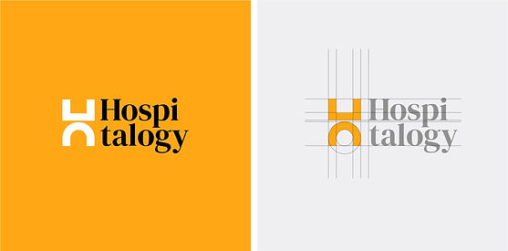
Healthcare is a complex and ever-evolving field of study. Everyday, discoveries are made and the science and methods get updated. It makes it hard for on-the-go entrepreneurs to focus on a lot of things.
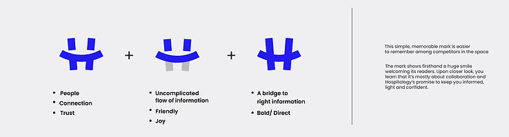
With that in mind, we came up with this design direction. We combined 2 icons to build the logo: The top icon represents the complex, rigid medical data, turning them into the more approachable, relatable (curved) message that it should be. The overall mark represents the letter H and is highly applicable in different media and sizes. It is designed to embody balance, structure & trust, whilst not being too intimidating. With this approach, we try to see the complexity and diversity of the industry as seen in the mark’s ability to be broken down and still hold meaning.


Route 02 - “Healthcare is the most important article of the day”


As entrepeneurs, it’s essential to be ahead as early as possible, and nothing boosts daily mood better than reading the morning rumor of news articles. However, there are times when what we read/try to understand in the morning is difficult. In this premise, we see the brand as a more collaborative and interactive content creator.
This idea revolves around taking overwhelming/intimidating topics and presenting them with joy and keeping it light. The mark depicts 2 people connected in harmony, which is presented to be in an abstract “H”. With harmony, information is much easier to digest. This approach explores the more youthful and lighter side of medical journalism - one that the younger readers/listeners will be able to easily identify with.

Route 03 - “Get the right message”


Information doesn’t have to be taken slower to make you understand it more. Hospitalogy’s
promise, to keep entrepreneurs informed despite their busy schedules is reinforced through this mark. It shows that as a brand, Hospitalogy values
how it communicates to its audiences in a manner that’s light and engaging.
The idea here is that the industry keeps evolving, and moving forward. Hospitalogy promises to be always ahead of what’s going on.
All three routes

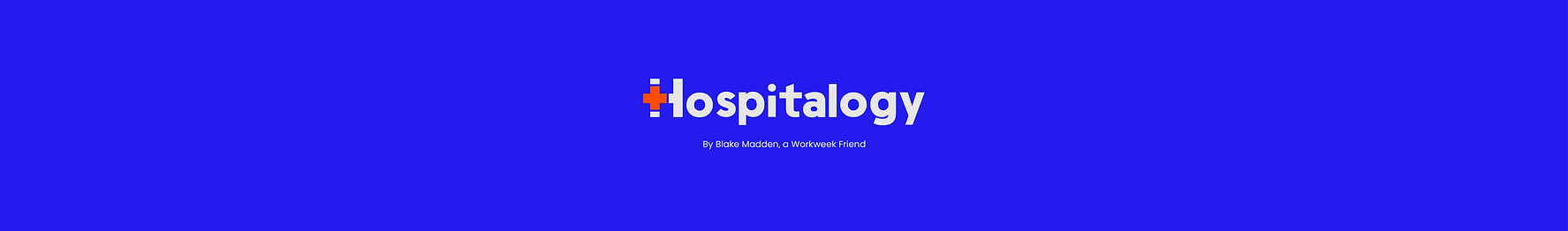
They opted for route 1 with minimal modifications. They expressed their desire for an icon that people can easily relate to when it comes to health, ensuring easy recognition. Instead of using a red color for the plus sign, they decided to change it to orange to avoid any issues related to color infringement. The selected orange color aligns well with the desired visual appeal and conveys a sense of vitality and energy associated with health.


As entrepeneurs, it’s essential to be ahead as early as possible, and nothing boosts daily mood better than reading the morning rumor of news articles. However, there are times when what we read/try to understand in the morning is difficult. In this premise, we see the brand as a more collaborative and interactive content creator.
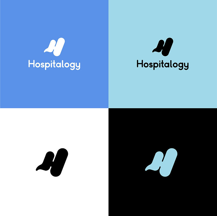
The main logotype combined with the icon is good for all types of media with its color and shape versatility. The primary logo must be used as the example on the right. The Icon can be separated from the type but the “H” must not be replaced.


Youtube Overview


