FULL BRANDING
DESIGNER / NHELSEN JO
ABOUT AROMA
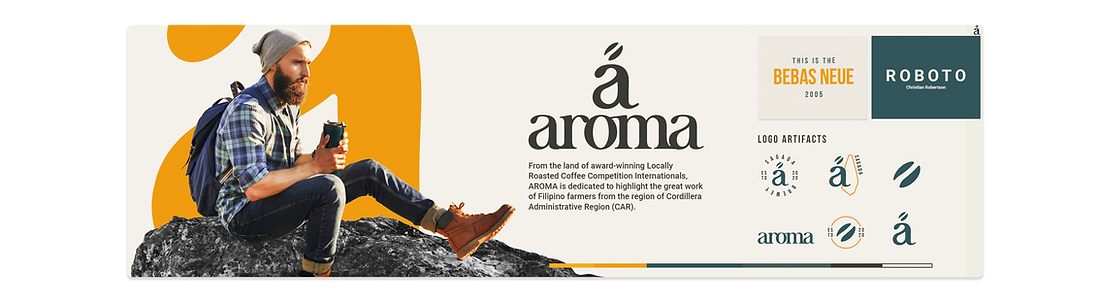
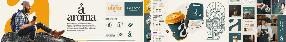
From the land of award-winning Locally Roasted Coffee Competition Internationals, AROMA is dedicated to highlight the great work of Filipino farmers from the region of Cordillera Administrative Region (CAR).
We are offering 100% fresh ground coffee beans that were naturally grown, hand-picked and hand-sorted by our local farmers and roasters in the mountains of Cordillera specially in the highland of Sagada, Kalinga and Benguet.
Dose up your day with the fragrance of roasted beans flowing inside our stores and enjoy the taste of peace and comfort inside the hustle and bustle city with a cup of your relaxing -scented coffee.
AROMA guarantees to serve the premium quality of coffee from your choice of Single Origin - Arabica, Robusta, Excelsa, Barako and other flavored coffee blends that will be prepared and brewed by the passion of our best talented barista.
We commit to provide our gratefulness to the Philippine artisans and engage with more customers and community in all over the world by promoting our local products globally.
PROJECT GOAL
Provide Aroma with a brand identity that reflects the locality of the brand regarding coffee.
Aroma is known for nature travelers or campers mainly in the mountains where most of the local coffees are planted ideally, the brand direction must be apparent to its nature.
OBJECTIVES
Produce a brand outlook for Aroma that is connected to the tagline
“Smell the taste of the mountain in one sip of coffee”.
The Earpod Branding must contain the following:
Mood Board l Logo l Stylescape l Mock-ups l Social media overview l Advertising posters I Web overview

Disclaimer
The client used in this work doesn't consider a real/existing client.
These following work serve as designer's offered skills that able to
showcase his work experience.
Mood Board
(A visual tool that used to communicate our concepts and ideas visually, This process is well well thought to successfully bring out the client's idea).
The initial direction for this mood board was to create a design that is locally-based and nature-inspired. To achieve this idea, the use of geometric patterns in a single weight is suitable. The patterns should be inspired by the Ifugao traditional arts, which are known for their minimal or single-line drawings that are used for communication. Additionally, the color choices for this design should be influenced by the mountains found in the Philippines. For example, the Marlboro mountain in Sagada changes its color into a golden hue when struck by sunlight during the golden hour. This is where the color inspiration for the design should come from.

Stylescape
The second process is where the mood board gets more comprehensive since these will serve as the brand direction. It begins with an image that we called the base audience of Aroma, it emphasizes traveler or tourist with a cup of coffee, it portrays a friendly aspect of the brand that Aroma could be your partner on your journey. Fonts are Bebas and Roboto these two compliments well in delivering a clear message multi purposely from Web to product package, due to its clean appearance and simple warmth design of the letter. Here Patterns were created minimalistic same as the traditional art by the Ifugaos this will be expected to be seen inside the packaging, store, or marketing post. In general, the stylescape was delivered successfully through its goal it reflects the locality aspects and audience that contributing to the brand.
(Logo and logo artifacts will be discussed after this section)

(Expanded view of the stylescape.)
Aroma Logo
The ideal logo must be easy to remember like you can able to draw within 10 or fewer seconds remembering it for the first time. That's where the direction of the Aroma logo is derive emphasizing only the "a" it was simply elegant to look, timeless and independent.

A Bean
The "a" logo is derived from its purpose as a determiner, used when referring to someone or something for the first time ( a bean, a coffee). Aroma logo is trying to portray not just its simplicity but to leave immediate information to the brain that made it easy to remember.
The bean shape on the top of "a" (serif font is utilized) is precisely the coffee bean, but how it made is creatively delivered to make it well balanced. The shape of the bean came from the "a" terminal and the space between the bean is came from the bowl of the "a" which all take place inside a single letter like a part of the DNA.
Logo Artefacts
Utilized as a tertiary logo. The particular involvement of these sets of artifacts is to empower logo exposure. Can be used as a stamp or as a design.

Displaying the versatility of the Aroma logo.
Impressions
These are images that test the functionality of the stylescapes. It helps to determine how versatile the brand in different applications and it also allows information for the client where the brand direction is going.
Ideal Store mock-ups for aroma.


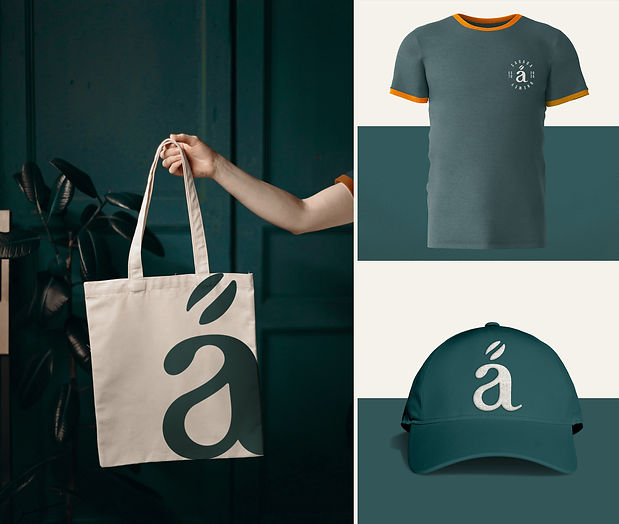
Aroma merchendise designs.

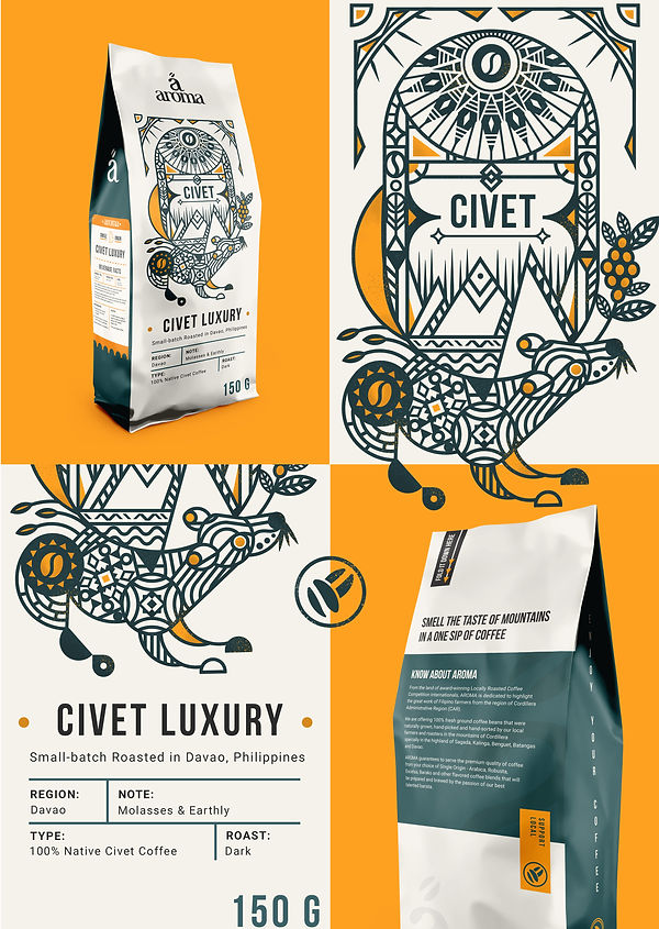
Product Sample
Mock-up in Coffee pouch product. As observe the complete brand guidelines is applied.

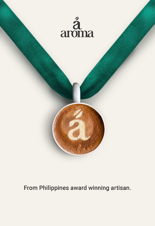
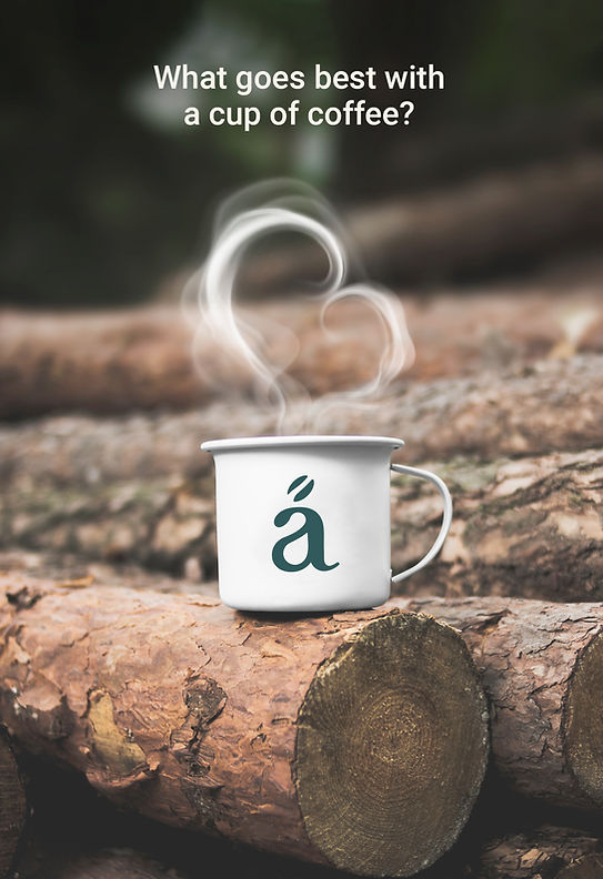
Advertising posters.
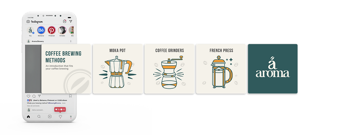
Socialmedia
One of the biggest tools for a marketing campaign is social media. Part of it is Instagram has over 800 million unique monthly users which are worth it to take advantage of the campaign. Here is a mock-up sample for Aroma Instagram grids and carousel.