

Gravy Rebranding
To visually rebrand Gravy was based on the potential that the brand holds in the market. As a brand that specializes in retrieving failed payments online, Gravy has carved out a niche for itself in the industry. However, the creator noticed that there were areas where Gravy was trying to personify itself, but it wasn't quite hitting the mark. Additionally, the design of the brand wasn't aligned with the overall tone of the copy. By rebranding Gravy, the creator hopes to give the brand a fresh look and feel that will resonate with its target audience and better convey its message.


Back
VISUAL IDENTITY REBRANDING
FINANCE RECOVERY
DESIGNER (PRACTICING BRAND STRATEGY)
/ NHELSEN JO
Project Goal
The objective is to craft a visual identity for Gravy that reflects its overarching tone. Given the brand's strong humanistic values, it is essential to effectively communicate these attributes through the appropriate stylistic elements in the brand's outlook.
Objectives
Conduct an analysis of the current brand to identify any areas where its design may be lacking. Use these insights to develop a visual identity that is closely aligned with the Gravy brand.
Gravy branding must contain the following:
Brand Attributes l Mood Board l Stylescape l Logo l Mockups l Sample UI
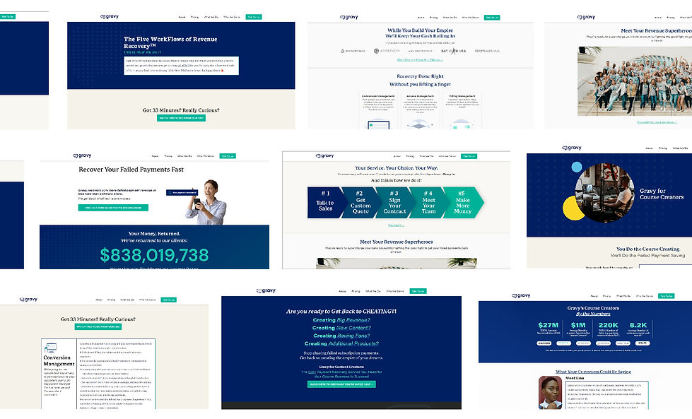
Garvy Current UI Design
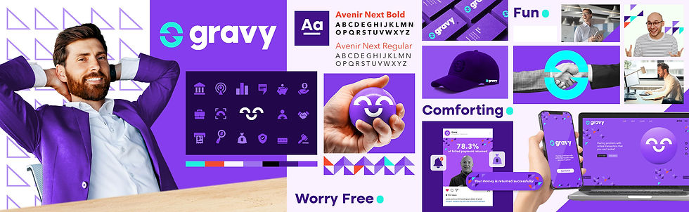
Friendly. Relief. Goal Centric. Blithesome
Upon observing Gravy's overall tone and brand, the creator identified four key attributes that stood out: friendly, relief, goal-centric, and blithesome. The brand exudes a friendly demeanor, creating a welcoming atmosphere for its customers. Gravy also offers a sense of relief by solving the problem of failed payments, easing the stress and frustration that customers may experience. The brand is clearly goal-centric, with a focus on achieving successful payment retrievals for its clients. Finally, Gravy's tone is blithesome, injecting a sense of positivity and joy into its interactions. These attributes will serve as the foundation for the rebranding effort, ensuring that the new design and messaging align with Gravy's core values and resonate with its target audience.
Stylescape & Logo Study
Study 1


Study 2
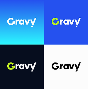


My decision to select study 1 over study 2 was based on the former's ability to evoke a more humane and friendly atmosphere while remaining aligned with the brand's goal-oriented image. Although both studies held promise, study 1 seemed better suited to capturing the essence of the brand's desired message and effectively communicating it to the intended audience.

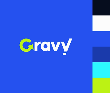
Logo Construction


G
Infinite
Endless Answer
and Possibility
Return
Trackable Process
Flag
Assurance &
Commitment
We all know a failed transaction is no joke, especially for businesses, it causes stress, distrust, and damage to your budget.
Therefore, my recommendation is to develop a brand direction that will increase brand confidence with fun and provide relief from finding a good return with ease like gravy.
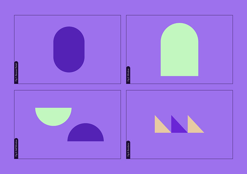

Fig 4: Bandana
Fig 3: Half Window
Fig 1: Recover Portal
Fig 2: Window


Design System
Overview
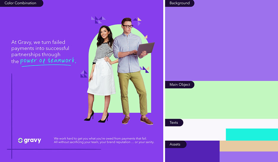
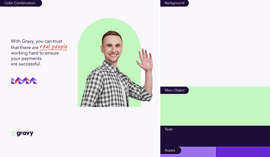
Here is a brief overview of the design system that I have developed for Gravy. The system includes carefully selected color combinations, appropriate icons, and a custom font style created exclusively for the brand. By using this system, Gravy can maintain a consistent and cohesive visual identity across all platforms and touchpoints, helping to reinforce its brand image and values.


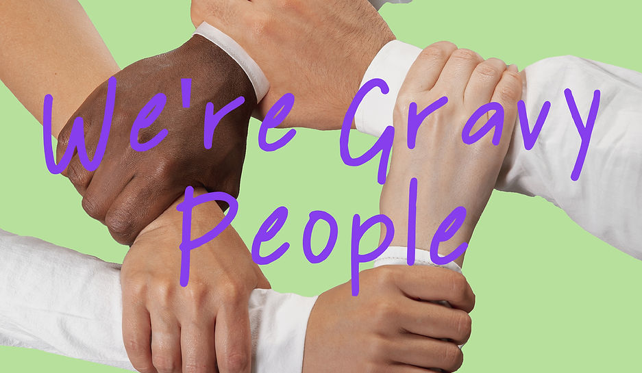
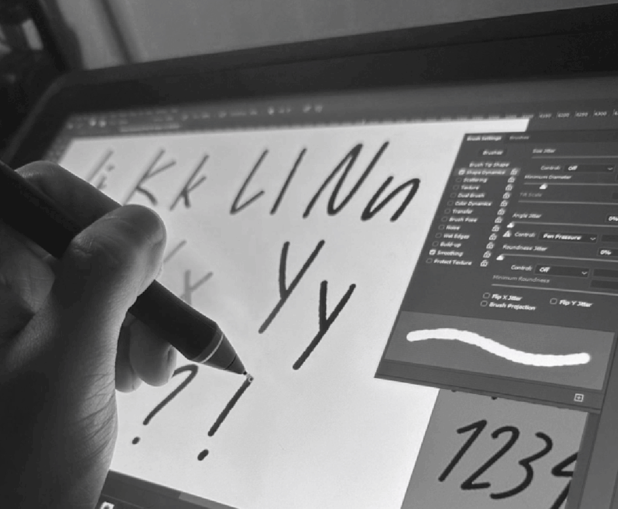
Gravy People
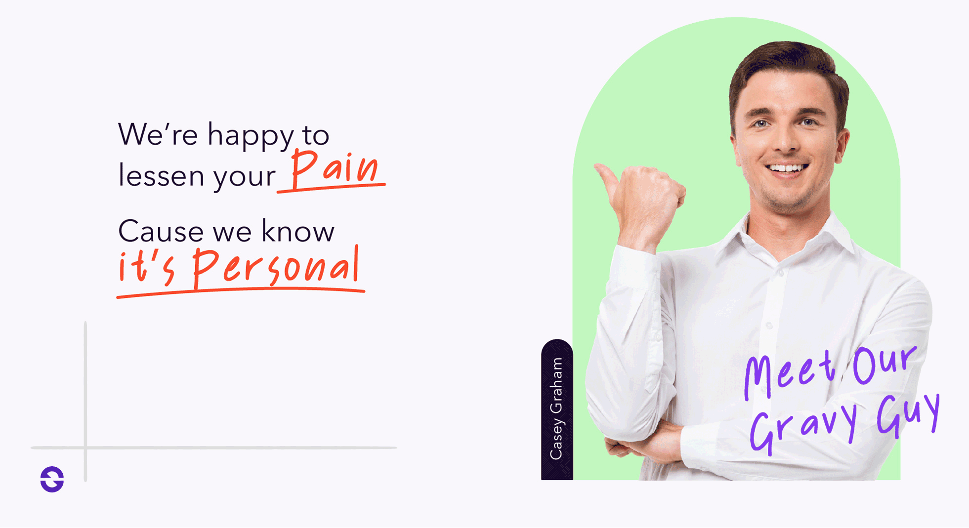
The font that has been crafted specifically for Gravy serves to highlight the human element behind every failed transaction, underscoring the brand's commitment to caring for its customers. The font's handwritten appearance creates the impression that someone is personally writing to the customers, reinforcing the brand's humanistic values. Overall, this bespoke font is a key element of Gravy's visual identity, imbuing the brand with a distinctive and personalized touch that resonates with its audience.


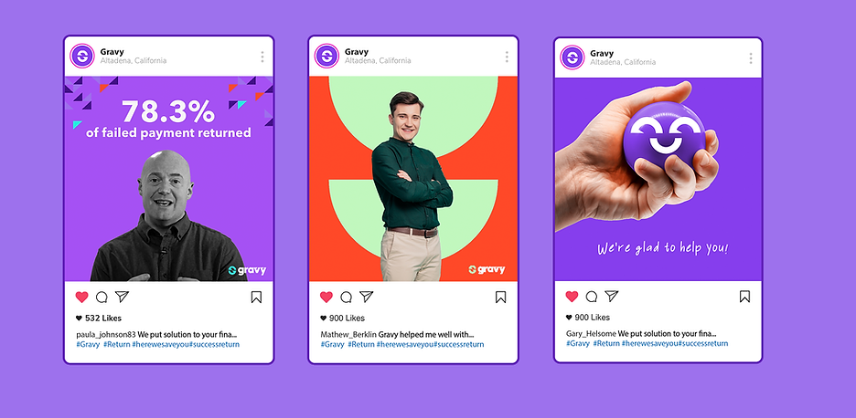
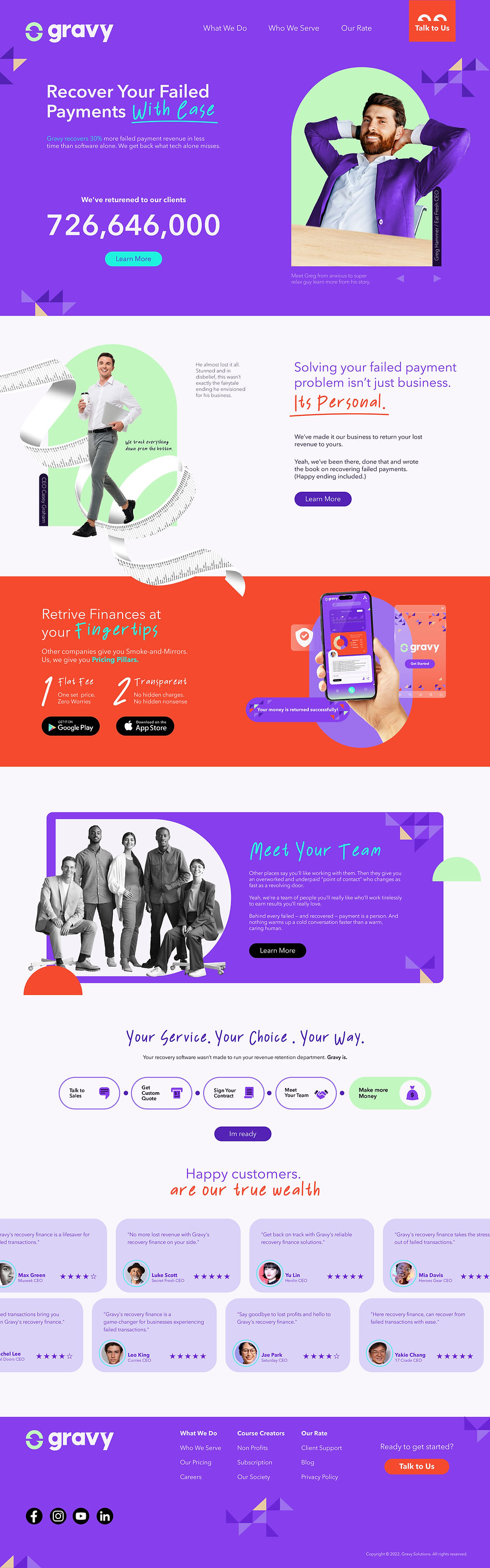
Gravy's New UI
I have implemented the new direction and tonality in developing the user interface (UI) for Gravy. The updated design presents a more approachable and vibrant look, accompanied by a relaxing color scheme. Crucially, the design elements have been carefully paired with the brand's tone to create a cohesive and consistent visual identity. I am confident that this revamped UI will resonate well with the target audience and support the desired brand image.


I would like to express my gratitude for taking the time to review my work. Through this study, I aimed to provide insights into how Gravy can enhance its branding efforts and effectively communicate its tone in a manner that is consistent with its design. I hope that my findings prove helpful in guiding the brand towards its desired image and messaging.